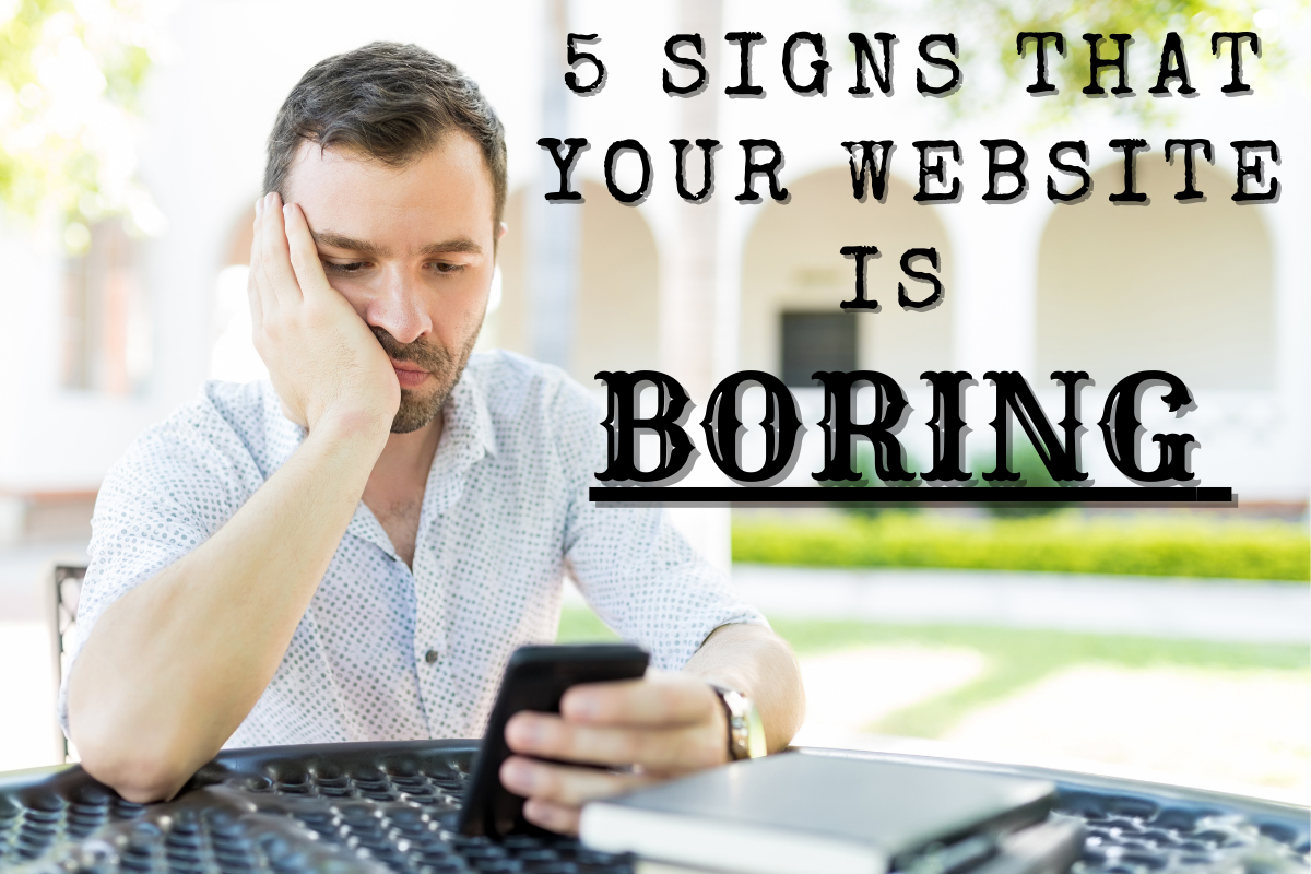
Any business owner should know that their website needs to engage visitors as soon as they land on the page. A boring site means that people are very likely to leave and find a competitor instead. And a high bounce rate doesn’t just mean that you are missing out on a lot of potential leads – it also lowers your site’s quality score, which can keep you from hitting the first page of search results.
So how can you tell if your website is boring? Here are our top 5 red flags, and how we can help fix them.
It takes too long to load.
People today are more focused on instant gratification than ever. So if your site takes too long to load, they are likely to get bored and move on. Studies have found that over half of users report leaving a site if it takes more than 2 seconds to load. We can help you to optimize your site to increase loading speed, which means happier visitors and lower bounce rates.
It doesn’t answer a user’s questions.
It shouldn’t be a surprise to learn that people are visiting your site to answer a question. Whether it’s comparison shopping or clicking through a display ad, your visitors can have questions ranging from what you offer, to why they should choose you over a competitor. And if your site doesn’t easily answer these common questions, a visitor is likely to lose interest. We can help by doing an analysis of your onsite content, and recommend rewrites as appropriate to ensure your visitors are getting the information that they need.
Your design is old or outdated.
The internet has come a long way in the last two decades, and most users have been around to see these changes. This means that they are a lot more in tune with design that you may give them credit for. Many users can spot an old or outdated design as soon as the page loads, which can be a big turn-off for both aesthetic and usability reasons. Outdated designs can be less user-friendly and more difficult to navigate, and old templates can take longer to load than newer optimized ones. Choosing a new design means a pretty big overhaul, but it also means a faster site that’s easier to navigate and is pleasing to the eye.
The color scheme isn’t working.
Whether it isn’t because your colors are too minimalistic and bland, or too high-contrast and dramatic, the wrong color scheme can throw off your entire site. Color should serve to make relevant information pop, and guide a visitor’s eyes along to ensure they can find the information that they are looking for. Our designers are experts in helping clients to choose a color scheme that both matches their branding and makes for a pleasant user experience.
There are not enough images.
People are visual creatures by nature, which means that they love looking at photos on sites. Photos can help display your products to their best advantage, highlight special features that set you apart, break up big blocks of text, and more. Images must also be high-quality and display without pixelation, all while loading quickly. Our team are experts in helping clients choose the right photos, placing them in the right places on each page, and in ensuring they load quickly while maintaining quality.
Trust an Expert Website Designer
If your website is boring, it is in the best interest of your company to give it a refresh as soon as possible. Ensuring that users enjoy your site is the biggest thing that you can do to help boost your sales and retain long-term customers. And chances are that refreshing your site is in fact much less expensive than you think.
With over 25 years of experience in managing all types of digital design. Our staff consists of highly-trained web design and digital marketing professionals who are both passionate about their jobs and excel at what they do. Contact us today to book a consultation with our team. We look forward to outlining exactly how we can help you grow your business with our digital media agency services.
